Our product photos came out of FLUX 2 Pro looking like they belonged in Cereal magazine. Sharp type on packaging. Believable brand labels. Beautiful letterforms rendered as part of a physical scene.
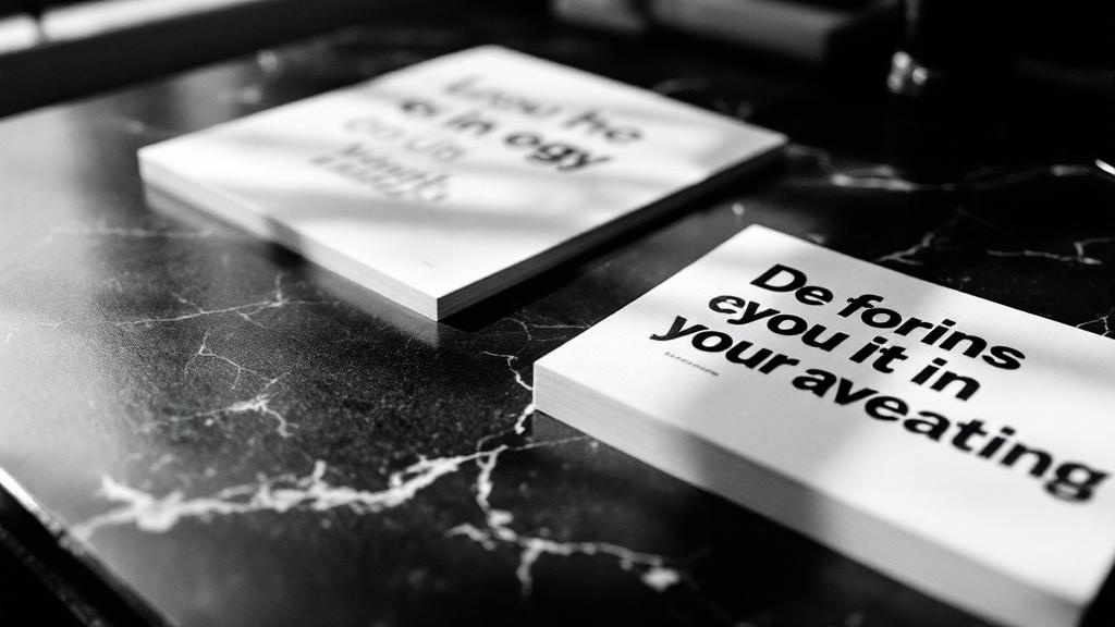
Then we asked the same model to generate a standalone logo wordmark. The result looked like a free font preview from DaFont circa 2009.
Same model. Same resolution. Same API. We spent two weeks figuring out why.
Photographer mode vs. graphic designer mode
When FLUX generates a product photo, text is incidental. It appears on a label, printed on packaging, embossed on leather. The model renders it as part of a physical scene, and physical scenes are what diffusion models were trained on. The text inherits the quality of the photograph.
When you ask FLUX to generate a wordmark on a flat color background, there is no scene. No physical context. No material to anchor the letterforms. The model falls back to its weakest capability: pure typographic rendering on a blank canvas.
Product photos look good because text is a secondary element in a rich scene. Logos look bad because text is the only element.
The luxury bias problem
Our first logo prompt was biased toward luxury:
Hairline thin strokes, sharp terminals, Hermès, Bottega Veneta, Cartier.This produced the same serif logo for every brand. A skincare company, a gaming startup, and a BBQ restaurant all got the same Didot-adjacent wordmark. The luxury house references overpowered everything else in the prompt.
We stripped the brand references and went minimal:
Typeface: ${font}. Modern, precise letterforms.Better variety. But the quality was still inconsistent.
The archetype typography fix
The breakthrough came from connecting logo generation to our visual archetype system. We added a typographyStyle field to each of our 6 archetypes:
| Archetype | Typography personality |
|---|---|
| heritage-craft | Refined transitional serif, high-contrast strokes, classical proportions |
| tech-forward | Geometric sans-serif, uniform stroke weight, precise circular curves |
| urban-edge | Condensed grotesque, tight apertures, industrial stroke weight |
| natural-organic | Humanist sans-serif, soft terminals, open apertures |
| opulent-classic | High-contrast modern serif, hairline horizontals, dramatic thick-thin |
| clean-modern | Neo-grotesque, even stroke weight, tight tracking |
Each description uses typographic vocabulary, not font names. "Geometric sans-serif with uniform stroke weight" tells FLUX what the letterforms should look like. "Use Futura" tells FLUX to guess what "Futura" means.
AI image generators don't have font files. They interpret font names as vague visual concepts. But they can interpret physical descriptions of letterforms: "tight apertures," "hairline serifs," "uniform stroke weight." We stopped naming fonts and started describing shapes.
Per-archetype font pools
Claude was picking fonts from a flat list of 14 options. 80% of brands got Cormorant Garamond because it was first on the list.
We replaced the flat list with 6 archetype-specific pools:
- urban-edge: Oswald, Barlow Condensed, Bebas Neue, Anton, Teko
- heritage-craft: DM Serif Display, Instrument Serif, EB Garamond, Fraunces
- tech-forward: Sora, Urbanist, Jost, Space Grotesk, Space Mono
- natural-organic: Cabin, Nunito Sans, Quicksand, Figtree, Maven Pro
- opulent-classic: Bodoni Moda, Libre Bodoni, GFS Didot, Playfair Display
- clean-modern: Inter, Hanken Grotesk, Work Sans, Outfit
59 Google Fonts total, mapped to 6 visual worlds. A sneaker brand (urban-edge) gets condensed grotesque type. A ceramics brand (heritage-craft) gets a transitional serif.
The font hint, not command
Even with the right font selected, AI models can't reliably render a named font. We changed the prompt to use the font as a soft hint:
Letterforms inspired by Inter — match its proportions, weight, and rhythm."Inspired by" gives the model a reference point without a hard constraint it can't satisfy. The typographyStyle provides structural guidance. The font hint provides specific character. Together they produce consistent results where either alone would fail.
Post-processing: the part that matters
Raw AI logos need cleanup. Our Sharp pipeline:
mainColor backgroundmainColorHex backgroundStep 3 is the key. AI models approximate colors. They'll give you #4B6C5D when you asked for #4A6B5C. By extracting the text as a mask and recompositing onto the exact hex value, every logo has pixel-perfect brand color regardless of what the model generated.
The gap that remains
AI logos are still worse than AI product photos. The archetype typography, font pools, and post-processing close most of the gap. A logo generated through our pipeline looks professional. It doesn't look like a free font generator anymore. But it doesn't look like a logo designed by a human typographer either.
The difference is in the details: specific kerning between "W" and "A," optical adjustment of round characters on the baseline, subtle weight variation in thick-thin strokes. These decisions require understanding shapes as shapes, not as pixel patterns.
Our approach: use the AI logo as a placeholder that establishes the typographic direction. The generated wordmark shows the right archetype, the right weight, the right character. Replacing it with a human-designed version means the designer already knows what world they're designing for.
The product photos don't need this step. Photographer mode carries the weight. The photos look real because text is a detail in a larger scene. Logos are the opposite: text IS the scene.