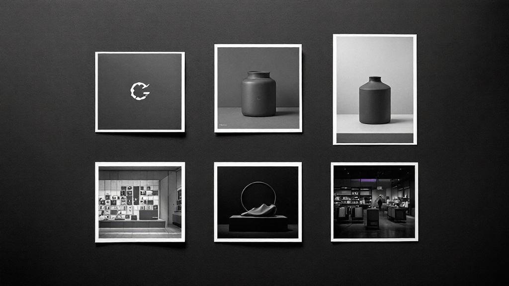
We had a problem that took three weeks to name. A coffee roastery brand would come out of our pipeline with a warm, editorial product photo, a cold clinical store interior, and a logo that looked like it belonged to a law firm. Each image looked fine in isolation. Together, they looked like three brands shuffled into one folder.
The system that fixed this is a single async function call. Everything else follows from it.
The problem
When you ask five different AI image prompts to generate five different scenes, you get five different visual worlds. Each prompt is independent. FLUX 2 Pro has no memory between generations. The next prompt starts from zero.
We needed a mechanism that threads a consistent visual identity across all five image prompts and the logo. Same camera language. Same lighting philosophy. Same color grading. Same material palette. Without making every image look identical.
One function, six images
The mechanism is resolvePhotoStyle(). It takes the brand's productCategory and returns a complete visual style object:
interface CategoryPhotoStyle {
archetype: VisualArchetypeName
photographers: string
lifestyleScene: string
spaceType: string
spaceDesc: string
productContext: string
colorGradeStyle: string
}
Every image job receives this same object. The logo, both products, the lifestyle editorial, and the store interior all share the same archetype, color grade, photographer references, and material palette.
Six archetypes
| Archetype | Camera | Film Stock | Feel |
|---|---|---|---|
| heritage-craft | Hasselblad 500CM | Kodak Portra 160 | Warm, unhurried, tactile |
| tech-forward | Sony A7R IV | Fujifilm Pro 400H | Clean, precise, cool |
| urban-edge | Leica M11 | Ilford HP5+ | Raw, candid, street-level |
| natural-organic | Fuji GFX 50S | Kodak Ektar 100 | Soft, gentle, natural |
| opulent-classic | Phase One IQ4 | Kodak Ektar 100 | Rich, dramatic |
| clean-modern | Canon EOS R5 | Fujifilm Pro 400H | Neutral, systematic |
Each archetype controls lighting, composition, typography style, and material palette across all image types.
The five connectors
1. visualDirection
The most important field. Claude generates it during synthesis: a one-sentence creative direction.
Warm Mediterranean light filtering through linen curtains, terracotta and aged brass, shot with nostalgic film grain.
This sentence appears in every image prompt. Two coffee brands can look completely different because their visual directions are different. The archetype keeps them in the same photographic language. The visual direction makes each brand distinct within that language.
2. The brand color block
The brand color appears in every image, but differently. In a product shot, the color is ON the product. In a lifestyle photo, it's one worn detail on the person. In a store interior, it's an architectural accent.
brand-block.ts generates three different color instructions from the same hex code. Same color, different application. The color anchors the brand without turning every scene into a monochrome ad.
3. Voice descriptors as gesture
Brand personality needs to appear in photos. You can't tell FLUX "this brand is unhurried." But you can pipe voice descriptors through the person's gesture:
The gesture feels unhurried and tactile.FLUX understands gestures. "Unhurried" produces slow, deliberate hand movements. "Austere" produces still, controlled poses. The voice descriptors come from Claude's synthesis, designed for brand copy, but they work as photographic direction because they describe human behavior.
4. productPhotoDesc
Claude generates two parallel fields per product:
- productDesc: Marketing copy for the brand book.
- productPhotoDesc: Photographer direction for the image prompt.
"Small amber glass dropper bottle with minimal label, placed on raw linen" gives FLUX something to render. "Cold-pressed Argan Face Oil, Atlas Mountains harvest" gives FLUX a metaphor to misinterpret as a mountain landscape.
5. resolvePhotoStyle() with fallback
680+ keywords across 49 style entries handle most categories. For edge cases ("bespoke fountain pen restoration"), a Claude Haiku fallback picks the best archetype at ~$0.0003 per call.
Store interiors: 45 real environments
We rewrote all 45 spaceDesc entries from generic showrooms to real category environments. A food brand gets an open kitchen. A furniture brand gets a workshop. A bookshop gets floor-to-ceiling shelves with reading nooks.
Every store prompt starts with "Modern, contemporary interior." Without it, a boxing gym gets a rundown warehouse from FLUX's training data. With the prefix, every space looks like it belongs in Architectural Digest.
Logo: archetype-driven typography
Our initial logo prompt biased toward luxury serif: "Hermès, Bottega Veneta, Cartier." Every brand got the same Didot wordmark.
We connected logo generation to the archetype system. Each archetype has a typographyStyle: heritage-craft gets "refined transitional serif," tech-forward gets "geometric sans-serif." We describe letterform characteristics, not font names, because AI models can't reliably render named fonts.
59 Google Fonts mapped across 6 archetype pools replaced a flat 14-font list where 80% of brands got Cormorant Garamond.
The competitive moat
The moat is the integration: archetype drives camera drives lighting drives color grade drives photographer drives scene drives person drives gesture drives color block drives anti-slop anchors. All from one resolvePhotoStyle() call.
You can build any one of these pieces. The hard part is making them talk to each other across six images and a logo without any image knowing the others exist.